
Carolyn Redford
UX Designer
"Our Place" Travel App
Overview
Through extensive research, it was found that a majority of people lack trust when it comes to third-party booking sites, specifically when it comes to the prices they provide. This app was developed to provide a place where customers could confidentially compare prices of various places and book a stay all in one place from a trusted source.
Problem: Finding discounts and deals for travel accommodations is exhausting and can feel like a scam.
Goal: Create a safe and user-friendly app that provides discount information for accommodations when traveling. Price comparing became, through research, the easiest and most available way to accomplish this.
Value proposition: "Our Place" provides a price comparison to quickly find the best price on accommodations for you.

Deliverables
Proto-Persona | User Persona | User Interviews | Affinity Map | Feature Prioritization | Value Proposition Statement | Storyboard | Journey Map | Competitor Analysis | User Flow | Wireframes | Prototypes | User Testing
User Research
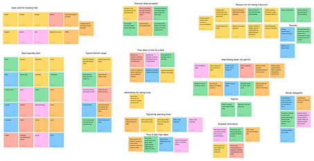
Initial testing focused on user interviews which provided answers to questions that involved how people go about planning their travels; what apps or websites are used, what user’s main goals are when planning, and what users hope to accomplish on their trips (excursions, restaurants, etc.). The majority of questions were focused on potential discounts or deals users seek out when booking accommodations. Five users were interviewed and the data was consolidated into affinity maps.
From there, the data was organized into various categories such as “Previous deals accepted” and “Reasons for not taking a discount”. A feature prioritization chart was then created to determine which elements would be most crucial to implement in the first lo-fi prototype.
Key Takeaways:
-
Greatest pain point was the overwhelm people felt when searching for good deals
-
Most app used to find a place to stay = Airbnb
-
People do not want to spend hours trying to find a deal
-
This leads to burnout and under-planned trips
-
Typically people are not willing to pay for an app or subscription that tells them the best discounts or deals available
-
People want a nice place to stay that is comfortable and safe, but still allows them to spend their money on experiences
-
They need their necessities covered, but not at the expense of missing out on other things they could do, see or eat
-
Most discounts for accommodations appear to be a scam
-
This scares people off and prevents them from taking the deal

Competitive Analysis

Airbnb is by far the best competitor. The app is well-organized: easy to search and put in your details. In addition to lots of available places to stay, they have an Experiences tab so you can book things to do. They’re only downfall is the customer service, which all the other companies also suffer from.

VRBO doesn’t have suggestions on the search page, but does have comparable places to stay when you’re on a house page. The login process is hampered by the OneKey option. It’s also nice to have the guarantee of renting the entire house.

Vacasa stood out because they have virtual walkthroughs. The app is well organized and you don’t have to create an account to book a place. The “Select Dates” page makes it hard to select a time because of the 2-night rule; it tends to glitch out a bit.. Also, it only lists places in the US.

Trusted House Sitters primarily is a animal-sitting app that allows the user to stay for free in exchange for taking care of the animals. It’s easy enough to see what is available in whatever location you want to go to. The only downside is you have to apply and be accepted to stay somewhere and you can not pick specific dates, so you’re trip is dependent on when other people take their trips. Excellent cheap-ish option if the user is flexible (membership payment is required).

Trivago essentially compiles a bunch of information from various hotel websites to compare prices and location. The biggest downside is that the user is required to either login or input their personal information multiple times since it opens up the 3rd party website to actually book.
Definition and Synthesis
After initial user testing was completed, a user scenario, storyboard and value proposition map were developed. Completing those along side the competitor analysis allowed us to look at various travel apps through the eyes of a user and figure out where certain gaps in the market are that could be catered to.
Value Proposition Statement:
Our Place, is developing an app to help budget-conscious travelers to save money on accommodations.Our app provides price compare to quickly find the best price for you.


Ideation
All the data from the user research section was distilled into a user flow that would take the user through the every single step they could take in the app.
The features selected to focus on when creating this new app were virtual walkthrough, deal guarantee and side-by-side comparison.


Each box from the user flow was made into a separate screen, except for the Search and Suggestion boxes because they would accomplish the goal of finding a location better if they were paired.

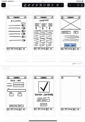
Prototyping
The wireframe proposes how the user will be able to easily accomplish the task of finding great deals for travel accommodations and booking them.
Using the competitor analysis, I was able to combine good ideas and eliminate pain points, while also incorporating the various elements that work well, such as the search function and minimalistic view.
The first lo-fi prototype iteration had color to distinguish the buttons as buttons, but ultimately this caused confusion, so for the second iteration a grey-scale was kept.
User Testing
User testing and feedback was instrumental. It pointed out the blaring elements that needed to change, listed below.
Scenario: Imagine you are looking for a place to stay in California for a week in the summer. Go ahead and find a place to stay.
The three tasks tested:
1. Search for a place to stay
2. Compare prices of places
3. Book a place to stay
These tasks were chosen because they accomplish the primary goals of the user when using a travel booking app. The compare task is specific to “Our Place”.
The way the prototype is configured did not allow for the user to click on the search bar. This created a lot of confusion. As well as not having the dates and amount of people on the same page as the search.
The compare option was also hindered by not allowing users to select which places they want to compare before navigating to that page.


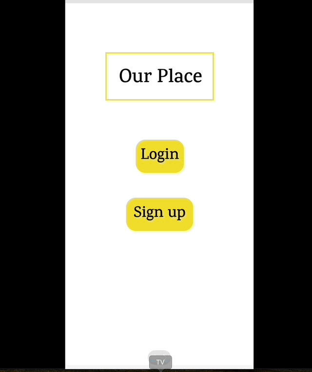
“I would immediately close the app if I couldn’t bypass the sign in. That's like proposing on the first date.”
Final Iteration

Future Opportunites
The proto-person shaped the demographics of the people interviewed. The interviews helped to determine the greatest goals and pain points of a user when it comes to planning trips.
Focusing in on that information, users want viable secure options for places to stay that are well-priced but still meet their needs and don’t overly-compromise in either direction. The prototype meets the user needs by allowing them multiple options where they can filter for their price range, but also compare the places that intrigued them the most.
The prototype could be improved by implementing active and inactive states for buttons. Specifically the main “Compare” button; inactive before any places are selected, and active afterward. Clearing up the back button and the pages the user is sent to would also be helpful. For example, when the user is on the Hotel Selection page, the flow back would depend on if the user came from the Favorites page, Compare page or the Search page.