
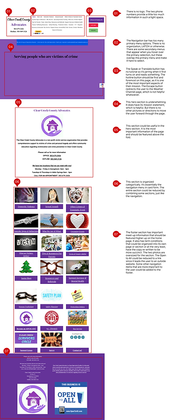
Carolyn Redford
UX Designer
Clear Creek County Advocates Redesign
OVERVIEW
Clear Creek County Advocates was started in the 80's as a victim advocacy resource. They focus on creating a safe space for victims to be able to make their next move forward. Our project focused on re-designing their website to make it more functional and modern.
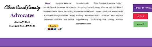
A primary challenge for users was easily finding the pages within the complicated navigation bar. Once they did find the right page, each one was slightly underdeveloped leading to more confusion for the user as their main purpose for going to this website was unfulfilled.

Deliverables
User Personas | Heuristic Evaluations | Stakeholder Interview | User Paths | Card Sorting | Site Map | Wireframes | Low and High Fidelity Prototypes
User Research
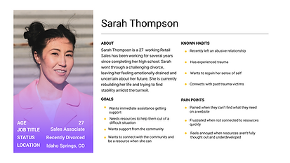
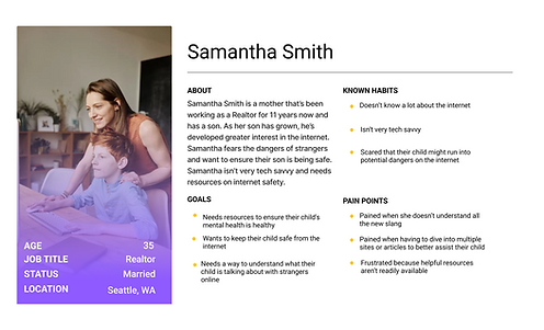
Two proto-personas were developed into user personas to gain the perspective of various users. The first is someone who has experienced trauma and needs a safe space to get help. The second is a mom concerned about her teenage son and his internet use.
By having two perspectives from users, our team was able to better determine what aspects and pages of the website were currently being utilized and what would be best to incorporate into the new design.
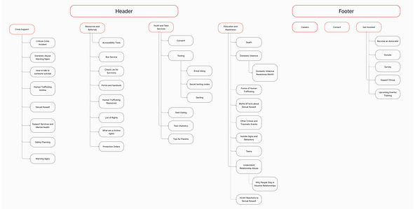
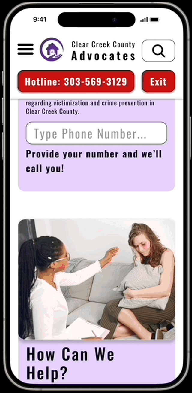
When a heuristic evaluation was done, the biggest issue found was the disorganization when it comes to the navigation. The amount of pages and the lack of information on each of them made it hard for the user to find what they were looking for. It also made the user loose trust in the organization. Using personas, we were able to find the most likely path through the website and focus on redesigning those pages. The stakeholder interview cleared up the purpose of some of the buttons. For example, the “Escape” button is a common option on most domestic abuse sites for the user to be able to quickly navigate away from the site without arousing suspicion from their abuser.
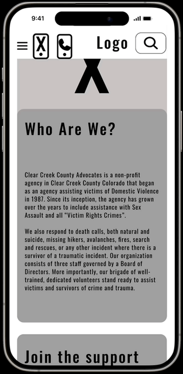
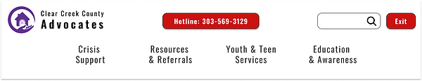
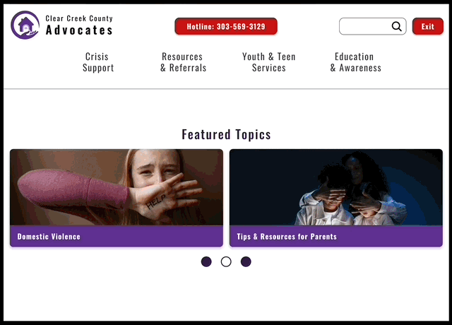
The navigation needed restructuring due to a complete lack of organization, making it challenging to locate what page the user was searching for. Most pages like the Home page (as shown) lacked informative and stylistically interesting content.
Definition and Synthesis

The five tasks given for the users to try were:
-
Identify the hotline button
-
Navigate to the “Who are We” page
-
Navigate to the “Basic Safety Planning” page
-
Find the “Tips for Parents”
-
And find the “Suicide Signs & Behavior” page
Six users were tested, leading to six key takeaways which were then prioritized in a matrix, Data points were summarized into themes. Users found the pages chaotic and navigating felt like a word search.
The card sort was the most important. It allowed us to see how the user would logically organize all the pages in a way that would make it easily flow for them. Once we had that and some user interviews, we were able to make the next steps of putting it together
“This would be so much easier if there was a search function!” - Quote from user
Ideation
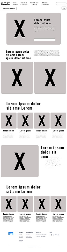
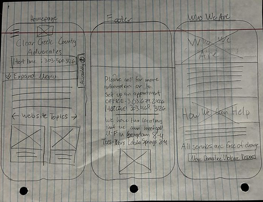
To start prototyping, rough sketches were created for the "Homepage," "Who are We," and "Suicide Signs & Behaviors" pages. The focus was on designing the header and footer, which were then turned into digital wireframes. These wireframes were refined to meet user requirements for a refreshed look, spaciousness, and ease of use, resulting in the first Clear Creek County Advocates LoFi prototype with added interactions.

Prototyping
Using the sitemap for reference while designing, a LoFi prototype was developed and then tested with five users. Two tested on mobile version, and three tested the desktop version. The three tasks we had them run through were:
-
Identify the hotline button
-
Define “Who Are We”
-
Find the “Suicide Signs & Behaviors” page
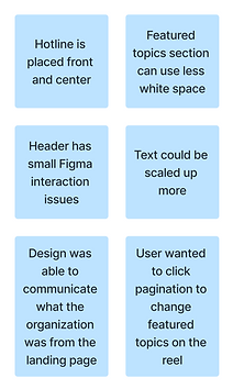
The data was prioritized for higher fidelity iterations. Users expressed dislikes for sizing and desired better page structure. The project stakeholder approved and was pleased with the prototypes direction.
Users expressed dislikes for sizing and desired better page structure. The project stakeholder approved and was pleased with the prototypes direction. Experimentation was done with hotline and exit site buttons to optimize functionality without being visually intrusive to users. Key improvements made:
Less spacing through the desktop, so users knew there was more to the page than just one section More changes to the desktop header Made featured topics reel pagination clickable Small Figma interaction were fixed
User Testing
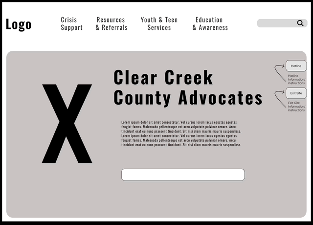
There was initial uncertainty about the header design for mobile and desktop. Initially considering removing the "exit page" button, it was later deemed essential for user safety in domestic abuse situations outlined by Bobby - a key stakeholder in the project. The header underwent multiple revisions to ensure functionality and user comprehension. User feedback highlighted spacing concerns in prototypes, leading to standardization with 20px from header to text and 40px between sections for improved flow.
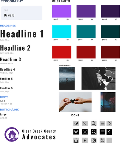
With an idea of a low-fidelity prototype, a style guide was developed to ensure consistency and aesthetics through the design process.
The design aimed for an informative vibe, utilizing colors and contrast to highlight CTA buttons while maintaining a safe and calming user experience. Colors chosen were inspired by associations with domestic violence (purple) and suicide prevention (blue).
Permission to edit the logo was also granted. The text was taken out, so it could be more easily manipulated. The colors were also enhanced.

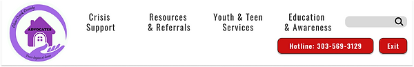
A desktop header was made. Then a new idea was introduced to simplify balancing, spacing, and efficiency. Both ideas were taken to users to showcase what the users found more appealing and easier to use. Many users voiced their delight with header B. This was then incorporated and polished into a final header design.
Header A
Header B
Final Iterations
Future Opportunites
The design needs more responsive interactions and user testing. Adding graphic elements can enhance visual appeal and reduce whitespace. The new navigation bar has significantly improved organization and clarity. Giving trust back to the users!
The future direction of the project could be to simplify the website's pages and combine content to enhance user navigation and access to information.